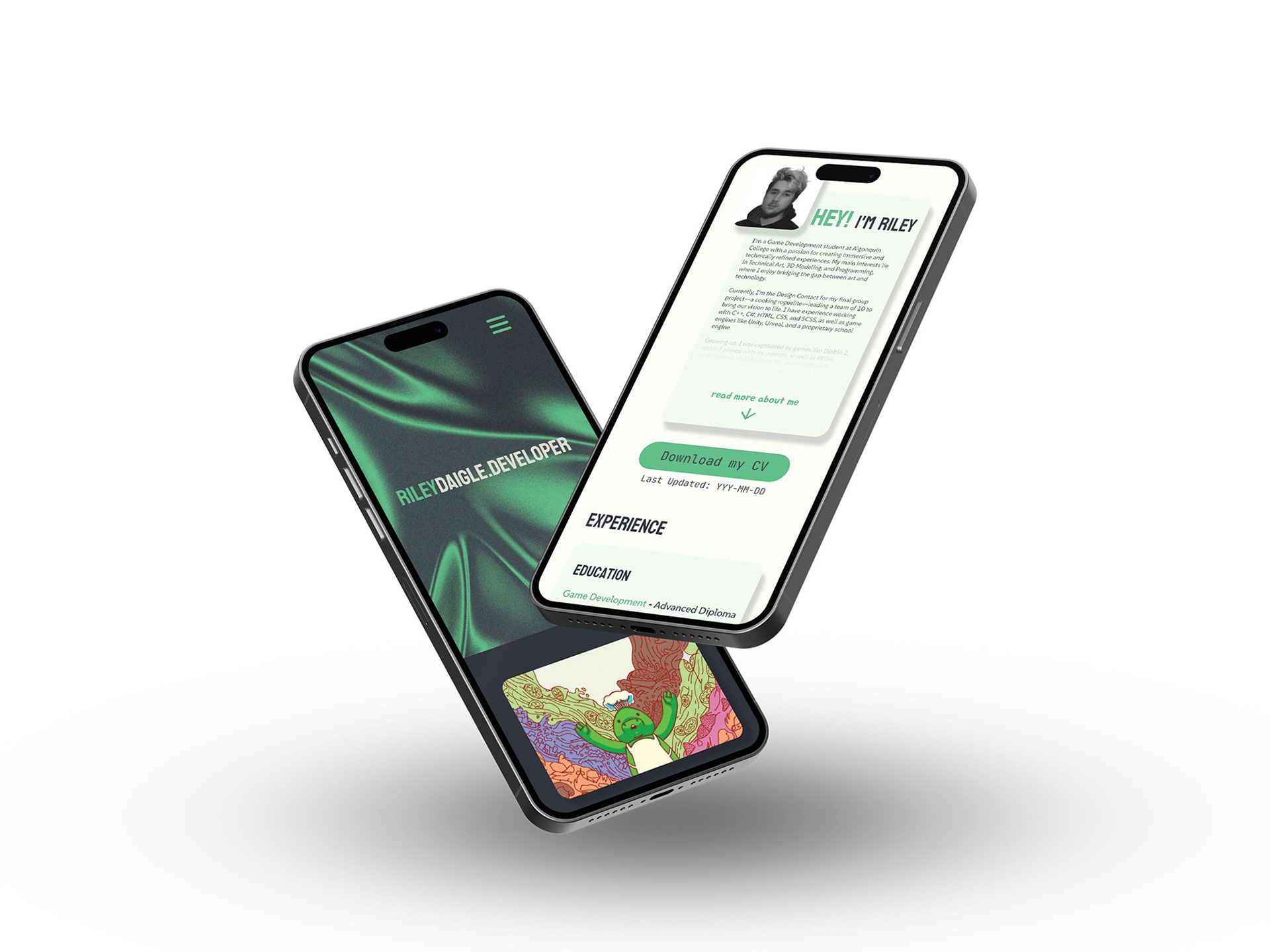
Portfolio website layout design for game design student, Riley Daigle. For the overall webpage, we decided to keep things to a single landing page since the client is still a student and doesn’t have a large portfolio to showcase yet. We wanted to keep the design clean and easy to expand on as more projects are added. Instead of using a solid black and white for the dark and light mode, I opted to use navy blues and off-whites that lean more green to cut back on the harshness. The rounded corners and subtle drop shadows add visual interest and make things feel more fun. The business card is simple, using the same style as the website header for consistency.
Created using Adobe XD.